Color permeates every aspect of our lives, sometimes temporarily and sometimes permanently, and often plays a critical role in our emotional, mental, and even physical state. Few places is that more evident than in our homes: inside, color sets a mood and makes a personal statement; outside, it sets the tone and nurtures a lasting impression.
Perhaps that’s why we as a society are so invested in color trends. Each year, paint manufacturers and color specialists release their “Colors of the Year,” a bit of a pulse on the consumer psyche (see our coverage of this year’s announcements here).
Color trends for homes don’t move as fast as industries like fashion and automotive. But they still ebb and flow, delivering a look into the tastes and preferences of new-home buyers and DIYers alike.
We checked in with two color experts—Renee Labbe, director of design strategy at Los Angeles-based Broadside Studios, and Kate Smith, color expert and president of Sensational Color—to see what’s on the mind of American consumers as we head into 2023.
Ongoing Macro Trends
Labbe notes that we’re under the umbrella of three ongoing macro trends, with each evolving in its own right. (These trends are based on research conducted by Labbe and Broadside focusing on roofing as a core element as part of an extensive Westlake Royal Roofing Solutions research initiative to understand what is influencing home design and roofing preferences today, so as to refine roofing offerings and respond directly to customer wants/needs.)
• Naturalism: Naturalism represents how we connect to the environment and comes through in natural colors and palettes you might expect. But within that, Labbe is seeing a trend toward more nourishing colors that are rural-inspired and create a contemporary escape. The simplicity and elegance of trendy blacks isn’t going away, for example, but is making room for dark greens, weathered looks, and rustic reds.
• Ease: Emerging around 2015-2016, Ease represents a move toward simplicity as a real-life antidote to our hectic online lives and frenzied social media airs. “If you’re getting constantly hit with images and details and you look up from your phone and see a space that’s clean and simple … the palette is one to two colors as opposed to five to six,” Labbe says. “This trend is a way for your eye to take in the totality of a look without having the take in all the bits and pieces of a design because it was so simplified. … And your brain relaxes.”
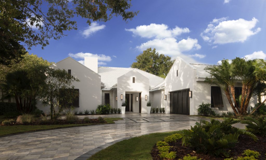
• Glamour of Opposites: Around 2016, we started to see a simultaneous trend that was a bit more in your face, a mish-mash of traditional and modern, with blocky and curvy existing side by side. This aligns with a time when consumers began making their voices heard as well as business disrupters like Uber and Door Dash. “We’re seeing this ability to change the old guard, change the system and reinvent it in a way that works for the people,” Labbe explains. “Design became this place where we could express an explosion of creativity.” On the exterior, this trend is coming through in the form of what Labbe describes as disruption and merged aesthetics. For instance, in a “clean traditional” or “quiet modern” style, the elevation remains traditional, but in a way that’s ornamented and with a palette of color choices that’s more modern or contemporary. There’s also more neutrality in color, with a two-color palette versus a traditional Craftsman home that may have three to five saturated tones. Today’s neutrals are high contrast, such as white with a strong black, brown, or gray.
This also shows in a blending of styles, such as a traditional façade with modern elements built in, a home with gabled roofs but a box-shaped entry, or a remodeled home with a traditional style original paired with a modern shape with similar colors to ensure cohesiveness.
Tips For Using Color Trends
When considering color trends, Smith explains that it’s important to approach reports like a menu—browse, pick a color as shown, or customize it to suit your tastes. “Use the color as your inspiration point,” she says. “If you want to use it exactly, that’s fine, but there may be similar tones that fit your home better.”
As Labbe mentioned, color trends last longer than we often think, especially in the home space. Gray, Smith points out as an example, isn’t as “hot” as it was a few years ago, but remains popular. Blue-green continues to attract the eye (and can be found in PPG’s Color of the Year Vining Ivy) and goes great with neutrals as an accent on the exterior or front door.
In fact, Smith says consumers don’t need to be overly concerned about using a trending color for fear it will become quickly dated. What puts a timestamp on it, she explains, is the combinations of colors. Think chocolate brown and aqua from a few years ago—it was the way that everyone was using them. “When looking at how to use these trends, use them in a way that no one else is using them, and then you won’t have to worry about looking dated,” she advises.
Trends are fun, Smith adds, but consumers are much more willing to go their own direction today. “In the end, trust your gut.”